

FlickFlick 1.12 is out. If you already have it, it updates itself; if you don't, it's free for Mac and Windows. Here's everything that changed, and why.
Three styles for the ring
FlickFlick has always looked quiet and flat. That's still the default, but now there are two more, under Settings → Preferences → Appearance → Style:
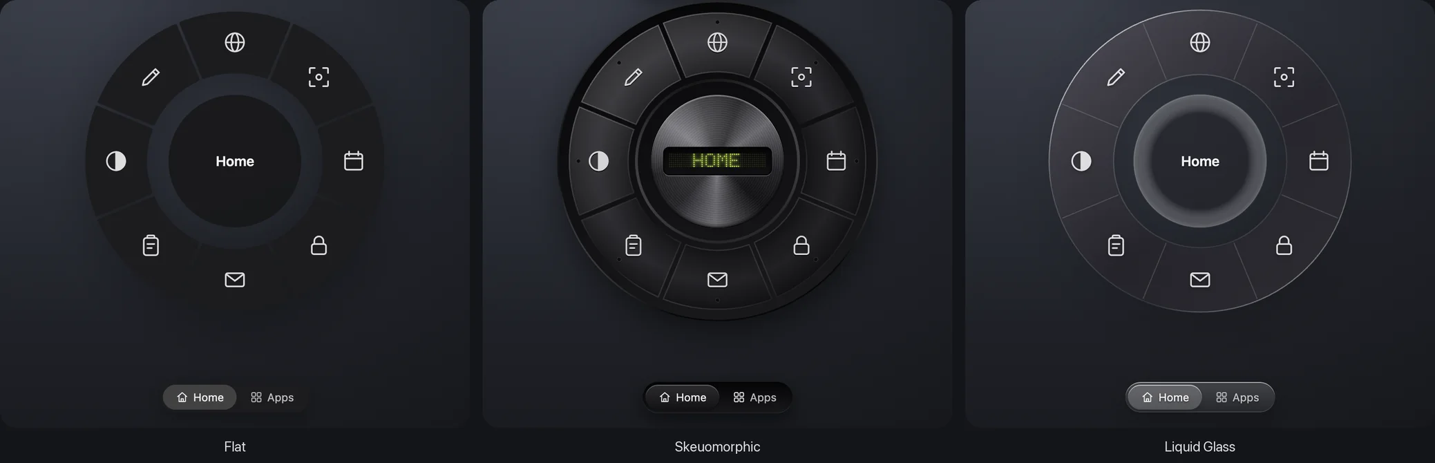
- Skeuomorphic. The ring becomes a real piece of hardware: matte keys with machined edges in a deep, anodized housing, a turned-metal knob in the middle, and a small LED on each key that glows in your accent colour. The label in the middle is an old-school LED display that scrambles through random characters before it settles, like a cheap clock radio finding its digits.
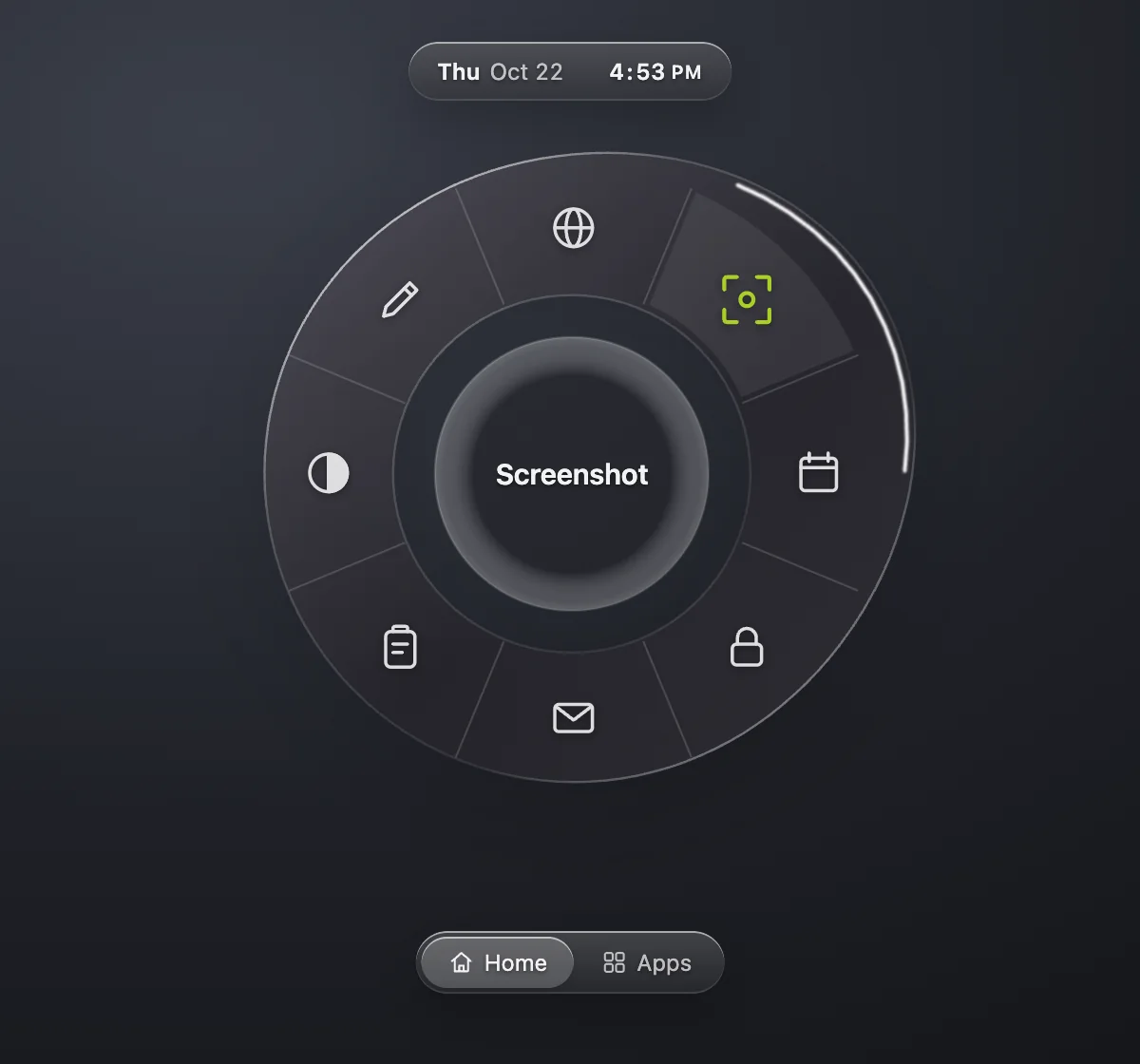
- Liquid Glass. One clear piece of glass with a bright edge. Point toward a slice and the glass swells that way, smooth like water held by surface tension, with light running along the swell. It follows quickly and settles without bouncing.
You can try all three on the download page: the demo ring there has the same switch.
Confetti for every season
Tap ⌘ twice, anywhere, and confetti bursts from your cursor. It follows the calendar: bats, ghosts and dangling spiders around Halloween, hearts on Valentine's, ketupat at Lebaran, snow at Christmas, red and white on 17 August, and balloons on your birthday if you tell it the date.
Don't like ⌘? Pick ⌥, ⌃ or ⇧ instead (Ctrl, Alt or Shift on Windows), or give the Confetti action any shortcut you want. It's silly, and that's the point: a tiny celebration when you finish something.
The date and time, one click away
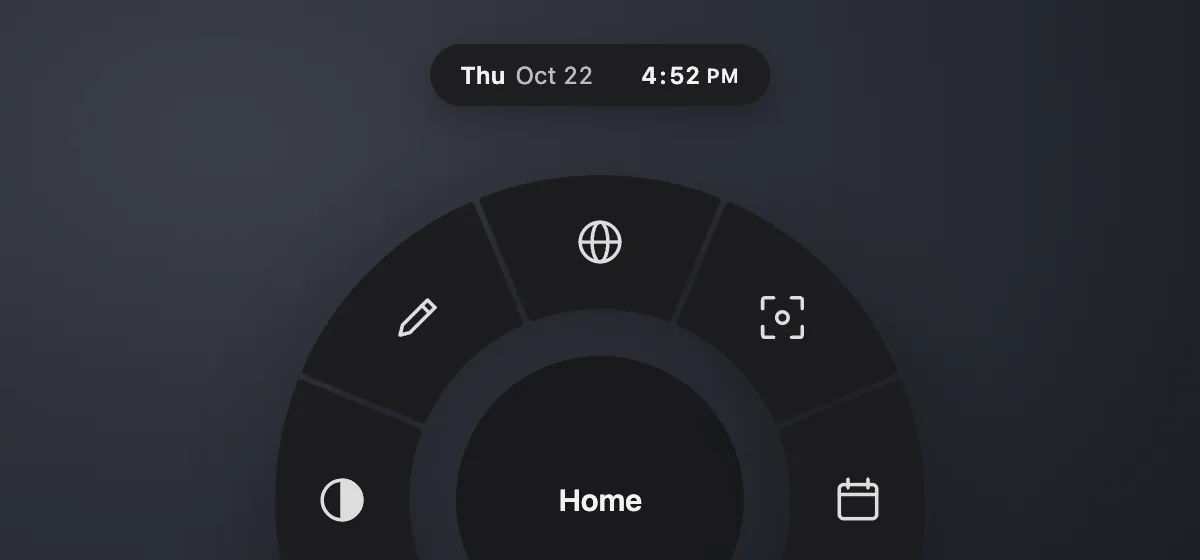
The date and time now sit just above the ring. Click the date to open Calendar, or the time to open Clock for alarms, timers and the stopwatch. In the Skeuomorphic style it looks like a bedside alarm clock, blinking colon included.
Point, don't aim
In my first post about FlickFlick I wrote that a ring beats menus because of Fitts's Law: every target is close and big. 1.12 takes that further. You no longer need to land on a slice. The slice in the direction you point lights up, even past the ring's edge. A quick flick toward it is enough, which makes the effective target almost a whole sixth of your screen.
A Settings window you can search
Settings had grown into a lot of separate lists. It's now one place:
- Search everything with ⌘F: rings, snippets, commands and every single preference.
- A tidy tree on the left: Rings, Library (snippets and commands) and Preferences.
- Preferences is one page in sections, and the tree follows along as you scroll.
- The ring list scrolls when you have many, with Add Ring always at hand at its bottom.
- The Permissions page is rewritten in plain words, and its steps no longer break into odd lines.
Smoother and safer
On Windows, a lot of small things used to start PowerShell for every key press, paste or "what's playing?". That made the whole app feel slow. One small helper now stays running instead, so:
- snippets expand as you type, like on the Mac,
- focus comes back to your app when the ring closes,
- app icons show up in Settings, the screenshot card appears after you copy or save,
- and FlickFlick has its own icon and name in the taskbar instead of Electron's.
Everywhere, it's harder to misuse: every window is sandboxed and can't navigate away, link types that can run code are refused, updates only install from FlickFlick's own release page, and the switches that would let another program run FlickFlick as a general script runner are turned off.
Get it
Download FlickFlick 1.12 for Mac or Windows →
Already have it? It updates itself, quietly, at a moment you're not using it. If something feels off, or you have an idea for 1.13, tell me. It's still free, forever.
Comments
No comments yet. Be the first.